This website uses cookies so that we can provide you with the best user experience possible. Cookie information is stored in your browser and performs functions such as recognising you when you return to our website and helping our team to understand which sections of the website you find most interesting and useful.
Network Analysis and Graph Databases – a Study of Connectedness in Social Isolation
Estimated reading time: 9 minutes, 2 seconds
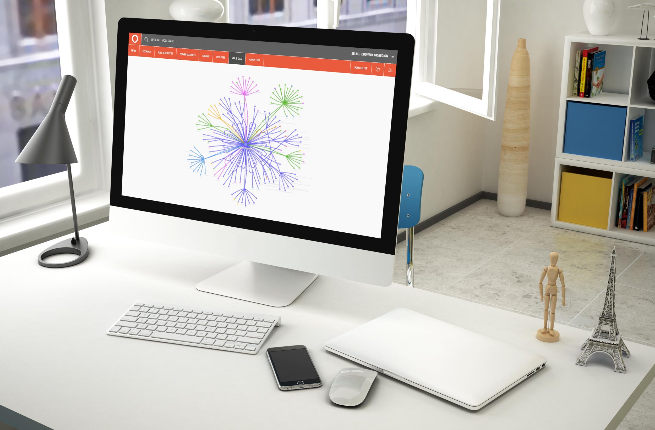
In this strange and reclusive period that the world is experiencing, it has become more obvious how interconnected we all usually are. As a data scientist, this reminded me of the importance of network science, where relationships between entities are analysed to help gain insight into the problem at hand. At Brainnwave we’ve utilized graph databases in our platform as GraphDB, so that we can use network analysis to help answer the questions our customers have about their data. The current situation brought on by measures gave me an idea: maybe we can use network analysis to see how social isolation can reduce the spread of COVID-19? This is a nice way to show the potential that GraphDB has to offer.
What is network science?
Lots of readers here might remember a bit of network science from school, I personally remember being introduced to the travelling salesperson problem. Imagine you’re a salesperson, and you want to visit a group of houses scattered across the city:
The order that you visit the houses changes the journey time between them, so what’s the most efficient way to visit all houses? We can represent the places the salesperson wants to visit by nodes in a graph, which are connected by edges that can be weighted by the journey time between locations:
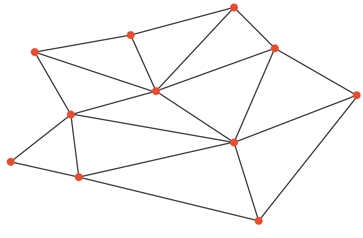
Once we write the problem in this way, there’s a lot of wonderful theory developed over hundreds of years by mathematicians, statisticians, and more recently data and computer scientists, that can be used to find the fastest route for us, or solutions to many other problems like this. Although the mathematician inside me could spend a lot of time talking about the particulars of algorithms and methods, here we’ll focus on how they can be used to help us understand our data.
The applications are more far-reaching than this simple classroom example: everything is connected! Almost any data can be boiled down to a collection of nodes connected by edges. For example, we can write almost any sentence as a tiny graph: the sentence “Brainnwave is located in Edinburgh” can be described as two nodes (Brainnwave and Edinburgh) connected by a single edge (“is located in”).
So, when does interpreting data as a graph benefit us? Perhaps the most famous use is the Google search engine, where webpages are ordered using the PageRank algorithm, which assigns a value of importance to each webpage by representing the results as a graph: webpages that are well-connected are given higher importance.
Using network analysis to understand COVID-19
The response to the COVID-19 outbreak by the data scientific community has been truly fantastic: there is now a plethora of resources available that can be used to study every aspect of the current situation. For example, the British Red Cross is designing a vulnerability index for local authorities across the UK, by combining clinical, demographic and social vulnerability measures, alongside other inequalities in the area. The UK government also provides statistics on locations of Coronavirus cases across the country. These examples are specific to the UK, there are similar datasets available for different countries and internationally.
Many researchers and data scientists have then utilized graph databases and network analysis, alongside this data, to provide valuable insights into the pandemic. The stirling work from data scientists across the world has the potential to drastically improve the outcome of the coronavirus outbreak, from using graphs to help scientists and researchers navigate the massive amount of research related to coronaviruses, to identifying international carriers of the virus.
This great visualization of a number of cases in Singapore makes me wonder about the following question: can we identify where the virus is most likely to spread using network analysis? With the prospect of social isolation measures remaining in place in some shape or form for a long period of time, by identifying hotspots where the virus is most likely to spread perhaps we can make restrictions more fluid, once the current peak has passed. This could help reduce the chances of a second wave of COVID-19 cases, while allowing a partial return to the social interactions that we all depend on.
Edinopolis – a synthetic utopia

To try out our idea, we’re going to create our own little utopia: Edinopolis. We create a variety of shops, schools, workplaces, hospitals and recreational areas which are then dotted around the city. Edinopolis has a population of around 50,000, we use information on around 4,000 residents that live in households of between 1 and 6 people, and are aged between 0 and 90. Students, doctors, retirees, postal workers and many more make up the sampled population, all of which walk, drive, or take public transportation to get to work, go shopping, attend appointments at their local GP or hospital, or for recreation. All these connections between people and places are used to emulate the real world. We can then assign a transmission risk depending on where people are going and how they get there: someone walking to the park would have a lower transmission rate than someone taking the bus to the hospital, for example.
It goes without saying that the real world is a bit more complicated than the urban paradise we have designed! However, our simplified should capture the behaviour we expect.
Application of the data: Identifying where viruses can spread
To identify people and places who have the highest infection rate, we can use the PageRank algorithm. We convert the Edinopolis dataset into a graph database; people and places are nodes, and visits connect people to places via edges in the graph. The result is over 4000 nodes and 12000 edges, just think of how many edges an entire city would have!
We can use our graph visualization tool to see what this data looks like. For example, we can zoom in on the Piper household:
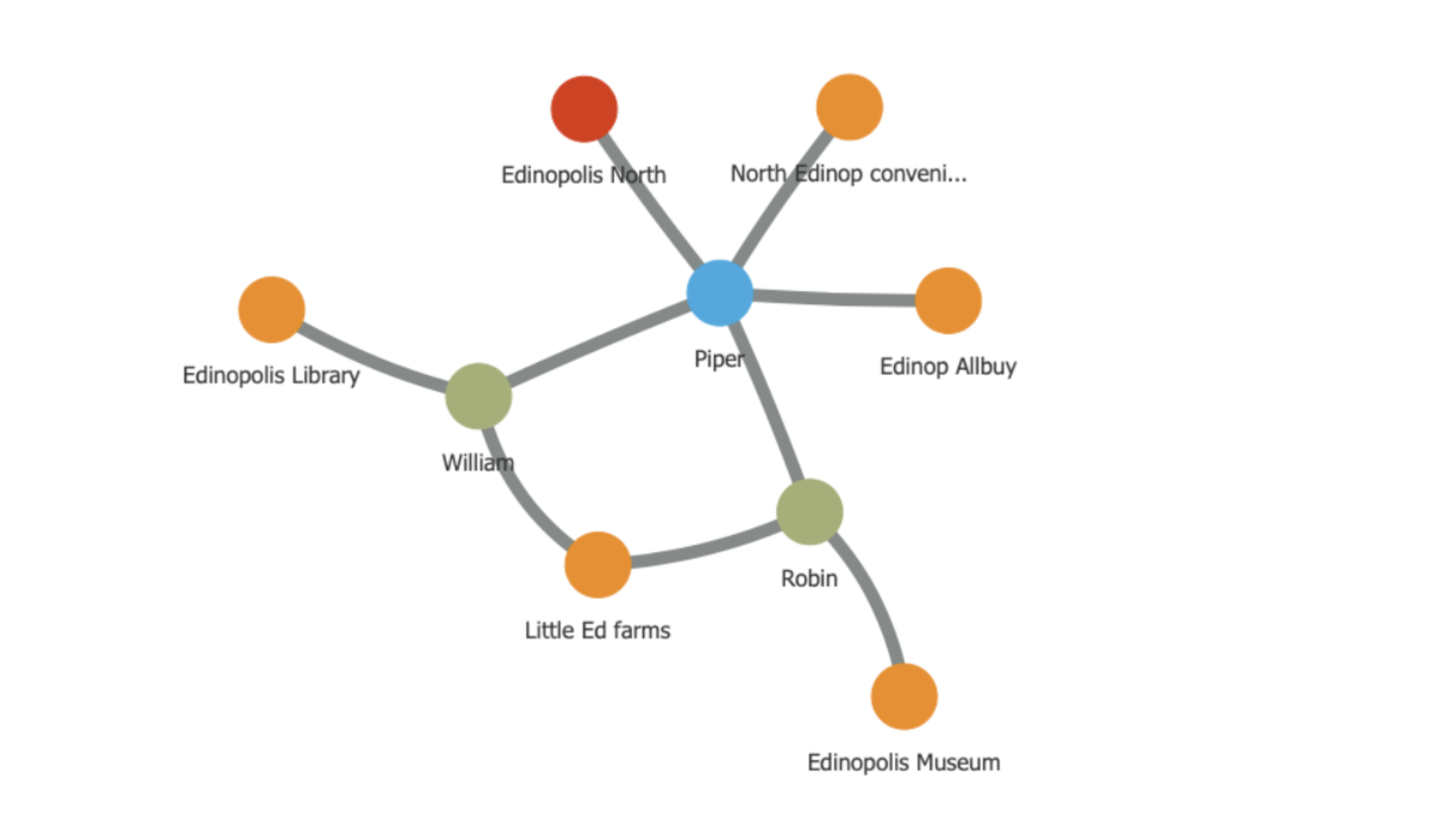
The Piper household (represented by the blue node) has two members: Robin and William, who are represented here by green nodes. They live in Edinopolis North (represented by the red node), and visit various locations across the city, i.e. the orange nodes. It seems like Robin is a fan of going to the museum. We can use the graph to visualize who else could come into contact with him in the museum:
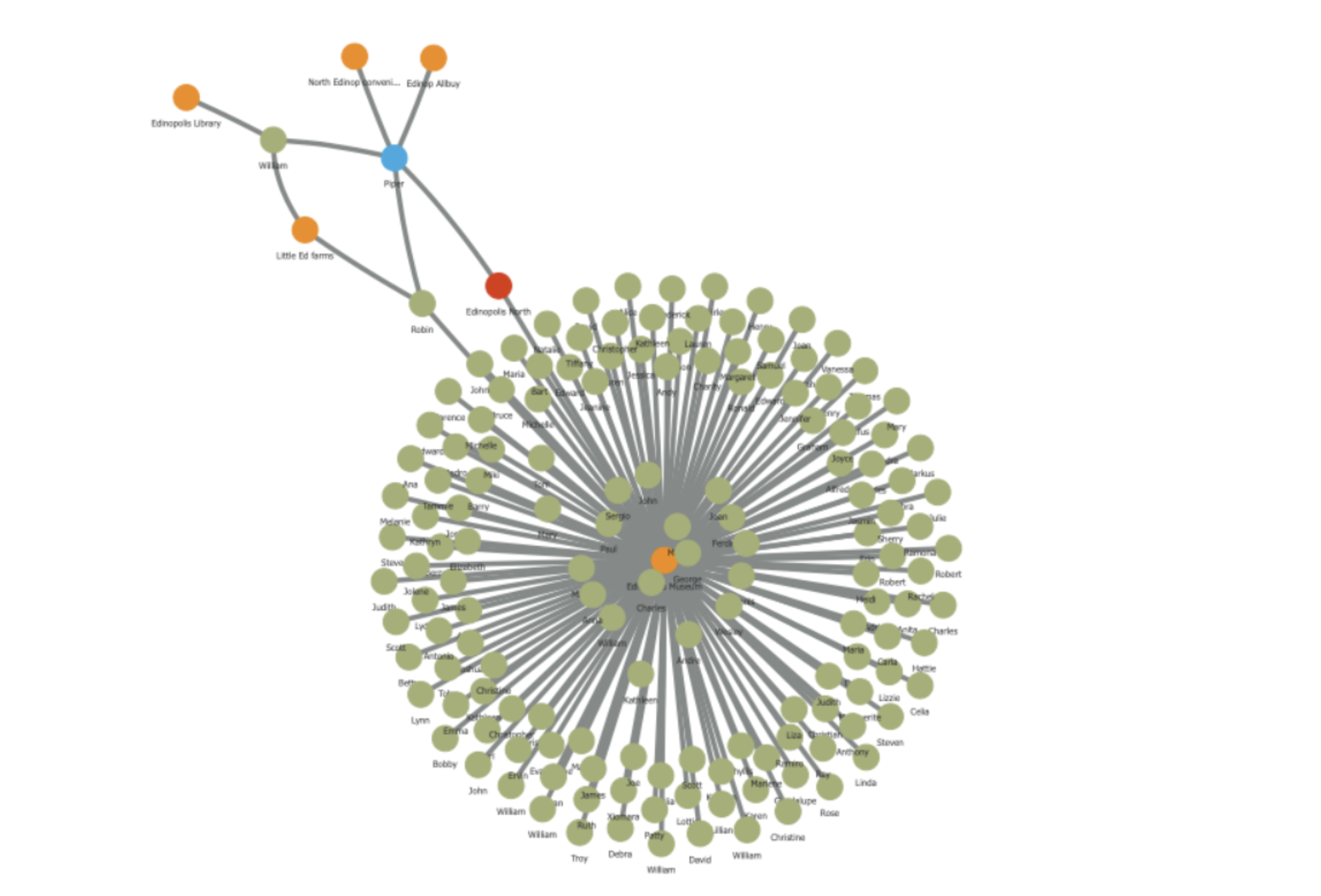
Edinopolis museum is quite popular! In turn, each of those visitors will come into contact with other people, households and places, due to work, shopping or social activities:
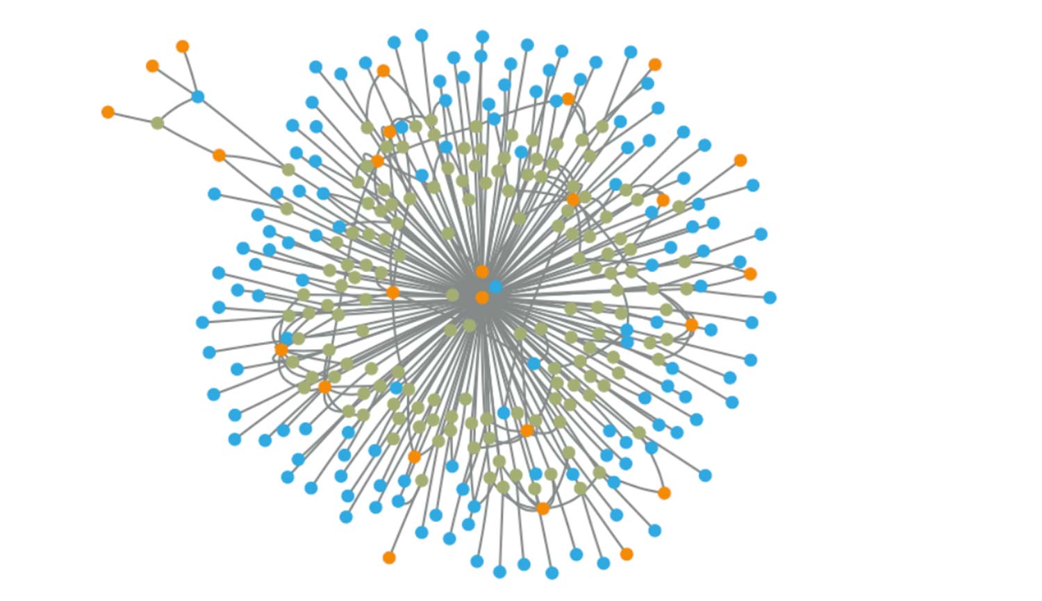
We can quickly see how complicated and interconnected a society can be. Viruses spread by passing between people or places, so places that are well-connected are expected to be high risk. We can therefore use the PageRank algorithm to measure the risk of infection of a person or place, where the connections between people and places are weighted by a transmission rate.
Here are the top 10 values of the PageRank algorithm for places in Edinopolis:
| Place | Transmission Score |
| Edinopolis Allbuy | 66.1286 |
| Edinopolis Superstore | 63.9349 |
| Edinopolis University | 19.1414 |
| Edinopolis Retail Centre | 17.1792 |
| Edinopolis College | 16.8218 |
| South Edinopolis Secondary School | 14.9074 |
| North Edinopolis Secondary School | 14.7131 |
| Edinopolis General Hospital | 13.7465 |
| South Edinopolis convenience store | 13.5682 |
| North Edinopolis convenience store | 13.4926 |
We see that the two supermarkets of Edinopolis are the most well-connected places in the city. This makes sense; every household shops at a supermarket of choice at least once a month in Edinopolis, so supermarkets are hubs of activity in populated areas.
Following this, places of education are also important. This again is because of the number of people that visit universities and schools. They even have a similar value to the Edinopolis General Hospital, where the risk of infection is, naturally, very high.
Further down the list are the various small churches, parks, museums and galleries that the people of Edinopolis are lucky to benefit from. So why do we need to close these non-essential places, when their transmission score is so low?
To answer that, let’s apply the same algorithm, but move Edinopolis into lockdown: pubs, museums, and galleries are closed, and citizens are advised to take social isolation measures, so all non-essential visits are removed from the analysis. The top 15 relative values of the PageRank algorithm are then as follows:
| Place | Transmission score |
| Edinopolis General Hospital | 20.2965 |
| South Edinopolis GP | 17.4378 |
| North Edinopolis GP | 16.1785 |
| Edinsville post office | 7.6292 |
| Edinsville GP | 7.1204 |
| Edinopolis post office | 6.6970 |
| Edinopolis power plant | 4.9281 |
| Edinopolis Airport | 4.1920 |
| Edinop Allbuy | 2.8078 |
| Edinopolis Bus station | 2.4552 |
| Little Ed farms | 2.2850 |
The results have changed a lot. Firstly, transmission rates are highest in hospitals and medical services in areas with large populations. This really shows that medical staff are currently on the front line of this pandemic, and that providing these doctors and nurses with the personal protection equipment and testing facilities they require is one of the most important ways we can combat the spread of COVID-19, alongside enacting a lockdown. Note that the value of the PageRank algorithm has actually increased here: this is not because the transmission rate has increased; the scores are relative, so should only be compared to one another.
Post offices also have a high transmission rate in Edinopolis. Diving into the data, we see that this is because post offices in Edinopolis are actually a hive of activity, and the PageRank algorithm identifies this Edinopolis-specific behaviour. As post offices are classed as an essential service, their transmission score persists after the lockdown takes place. This shows the importance of social distancing policies in essential shops that remain open during lockdown, and suggests that applying the same methods to different datasets will produce location-specific results.
By removing non-essential services such as schools and universities, the transmission rate of various shops and supermarkets has significantly reduced; Edinopolis Allbuy supermarket has a much lower relative score. Social isolation measures have therefore reduced the risk of infection, not only by removing places where transmission risk is high, but also by reducing the risk of transmission in well-connected essential services such as supermarkets. Staying at home can really save lives!
Where can we take this?
At Brainnwave we have been using graph databases to gain insight into our data in several different ways, and the analysis of transmission rates in the virtual city of Edinopolis is just one of the ways to show how network science can help us extract information from our data. By implementing these methods on real-world datasets of local amenities we could help people who are medically or socially vulnerable understand transmission risks in their area, and tailor our results to other cities and places.
As just one of the tools at the fingertips of data scientists, there are countless ways network science can help us gain insight and intelligence from our data. The world of network science is also constantly developing, and by utilizing the state-of-the-art output from modern research, we can gain unique and valuable information from our data which make a positive change in these difficult times, and beyond.