This website uses cookies so that we can provide you with the best user experience possible. Cookie information is stored in your browser and performs functions such as recognising you when you return to our website and helping our team to understand which sections of the website you find most interesting and useful.
Edinburgh, Connected: A Real-world Application of Network Science
Estimated reading time: 8 minutes, 18 seconds
The research discussed in this blog post is a result of a joint project between Brainnwave and the University of Edinburgh, with student Isabell Linde and academic partner Dr. John Pearson.
In many countries strict lockdown measures have successfully mitigated the initial surge of COVID-19 cases. Local and national authorities now need to understand how we can re-open society, without risking any large increase in the number of cases. To re-open society as effectively and safely as possible, we need to utilize all of the available data and analysis. In the previous post, we saw how network analysis and graph databases could help understand the effect of social isolation measures on the spread of COVID-19, in the synthetic city of Edinopolis. How would the results change if we applied the same modern PageRank algorithm to a real-world network? Can we use these results to improve our responses to new infections, in this period of lockdown easing, and therefore avoid a second surge? In this blog post we will use graph databases and network analysis to model the city of Edinburgh, and analyse the model to see how social isolation can reduce and understand the spread of COVID-19 in the city of Edinburgh.
Edinburgh – a real-world network
We have extracted population and household sizes in Edinburgh from the data made available by the Scottish Government. We have real locations, authentic populations and household data from Edinburgh. We were able to obtain accurate estimates of population sizes for each Data Zone in Edinburgh from the 2011 Scottish Government Census, where Data Zones are the primary geography for the release of small area statistics in Scotland and are widely used across the public and private sector. We can visualize the population density for the Data Zone and multi-member wards (MMWards):
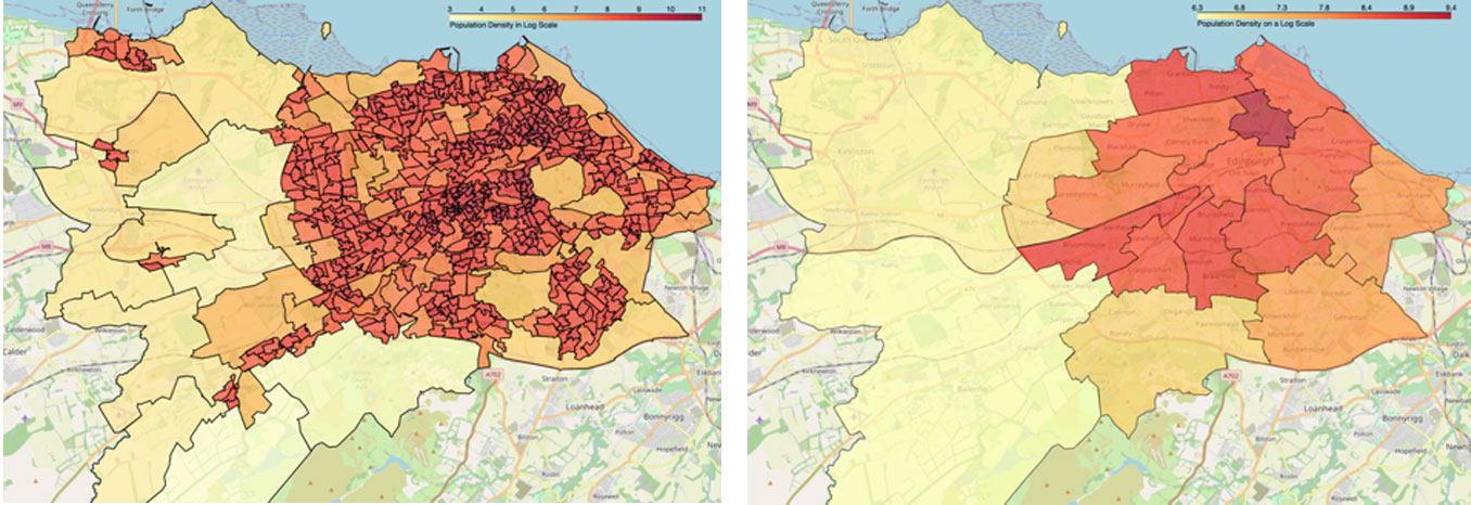
We can see that areas in the city centre are more densely populated than the residential areas located in rural areas outside of the city.
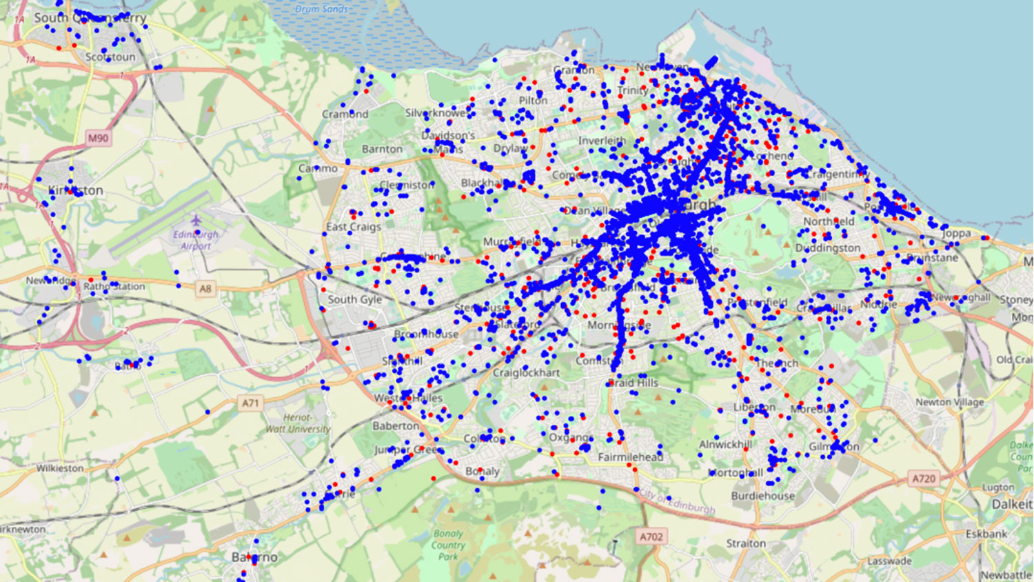
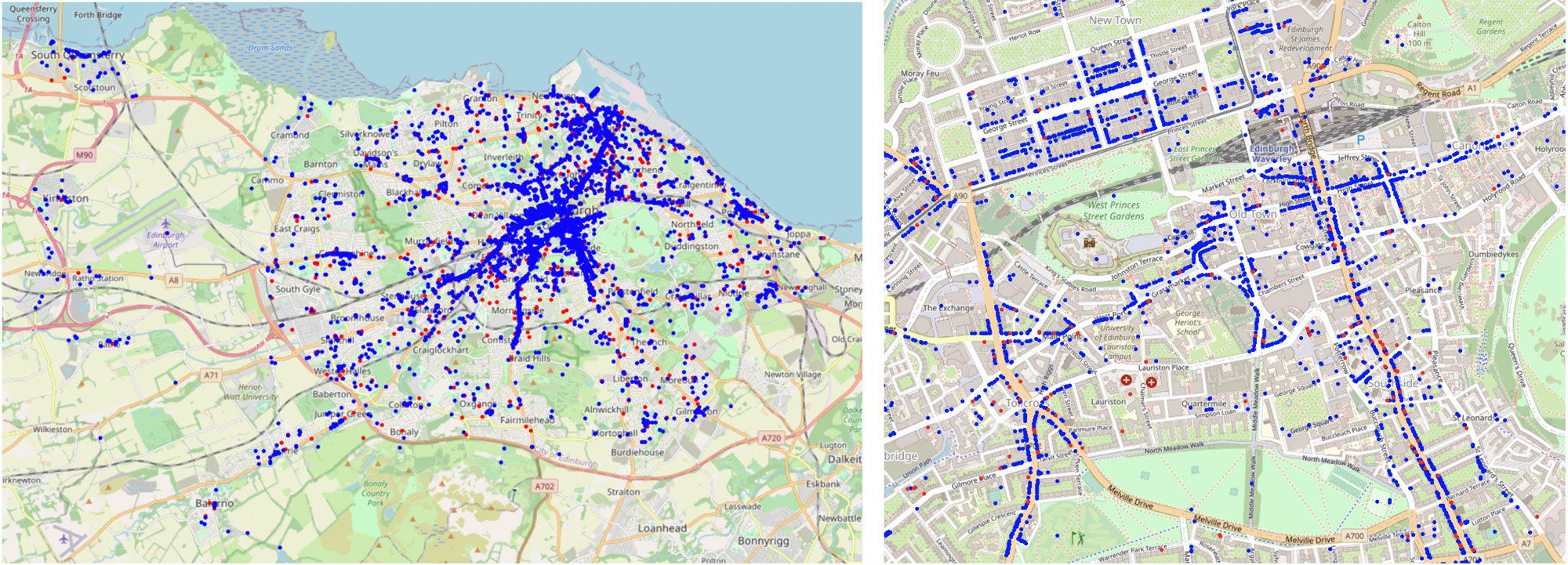
As for the data on locations in the city such as hospitals, restaurants and pubs we used Edinburgh Council’s open data portal and scraped OpenStreetMap data for information on locations in Edinburgh. We gathered a combination of non-essential and essential locations where approximately 13% of the locations in our dataset are deemed essential by the Scottish Government. Essential locations include places such as hospitals and supermarkets, whereas non-essential locations include restaurants, pubs, and hair salons. Overall, our dataset includes a total of 8,572 authentic locations in Edinburgh. Here we detail which locations are essential and which are non-essential (blue: non-essential, red:essential):
Application of the data: Identifying COVID-19 hotspots in Edinburgh
After collecting all the available data for Edinburgh populations and locations, we convert the data from Edinburgh into a graph database using Neo4j. Similar to how we constructed Edinopolis, people and places are nodes in the graph and visits connect them via edges. With the available household and population data, we can also use a probabilistic model to produce a population structure that is as accurate as possible. As a result, the graph of Edinburgh contains over 700,000 nodes, 239,451 of which are households and 518,500 are people. There are then over 2 million edges that connect people and places.
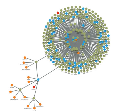
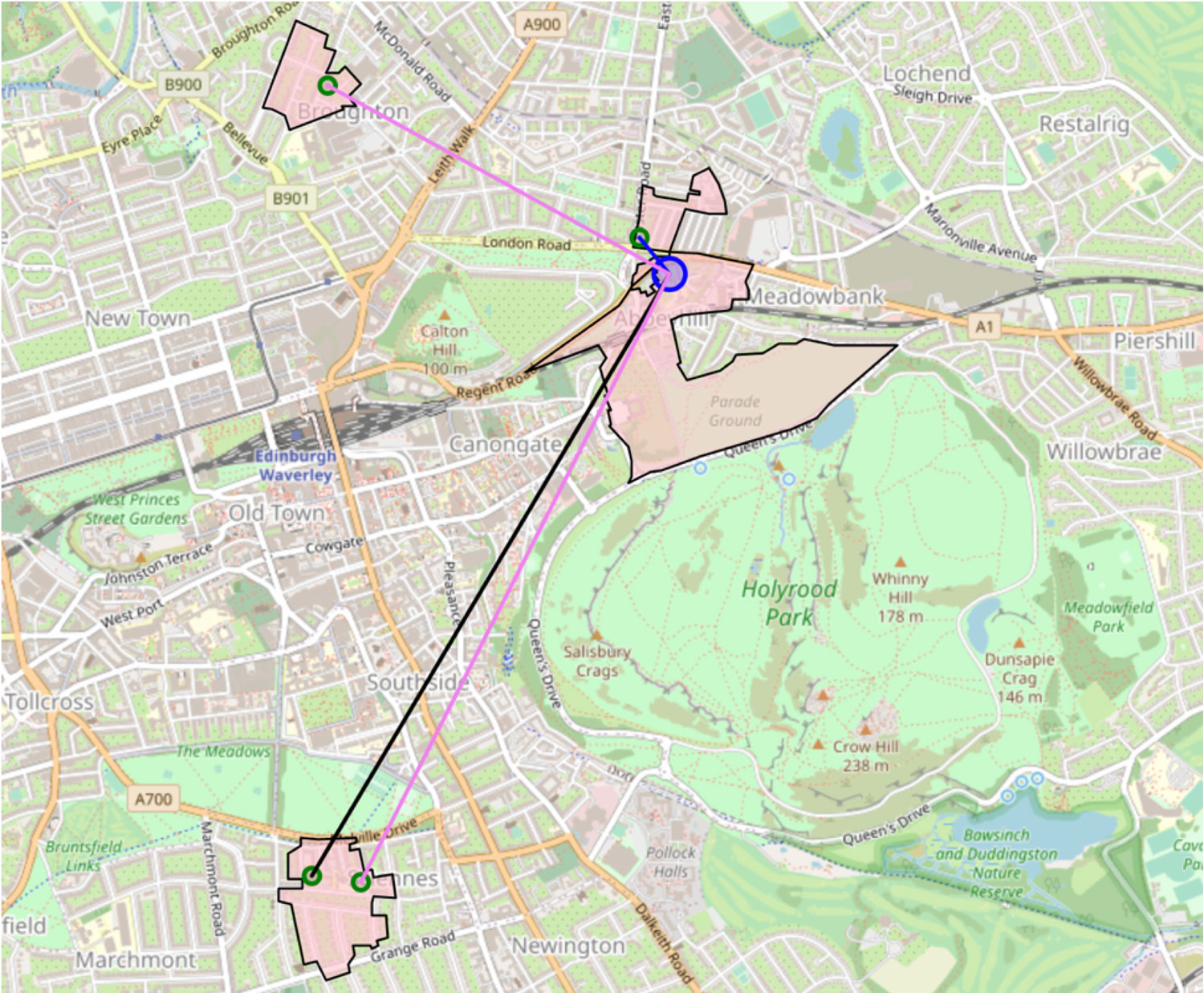
As an example, we can take a look at the Smith household within the graph database:
This household (represented by the blue node) has three members: 41-year-old Jennifer, 4 year old John and 12-year-old William (represented by the green nodes). They live in the Data Zone known as ‘Abbeyhill – 01’ (represented by the red node) and visit various places across the city (represented by the orange nodes). We see that Jennifer works at the Royal Hospital for Sick Children, and that William likes to visit the Portobello Swim Centre. Let’s use the graph database to see who else William could potentially come in contact with by visiting the Swim Centre:
By visiting Portobello Swim Centre, William risks coming into contact with dozens of people and households. Each of these visitors could spread the virus to any other location they visit across the city, where other visitors could then also transmit the virus, and so on. We can quickly see how infections can increase exponentially in the population, and how interconnected and complex a city truly is.
Since the data comes from authentic locations in Edinburgh, we can visualize different locations that the family visits on a map of Edinburgh. The blue circle in the centre and the blue lines represent the Smith household and the places that the family visits as a group, while the black, pink, and red lines represent visits that John, Jennifer, William visit independently.
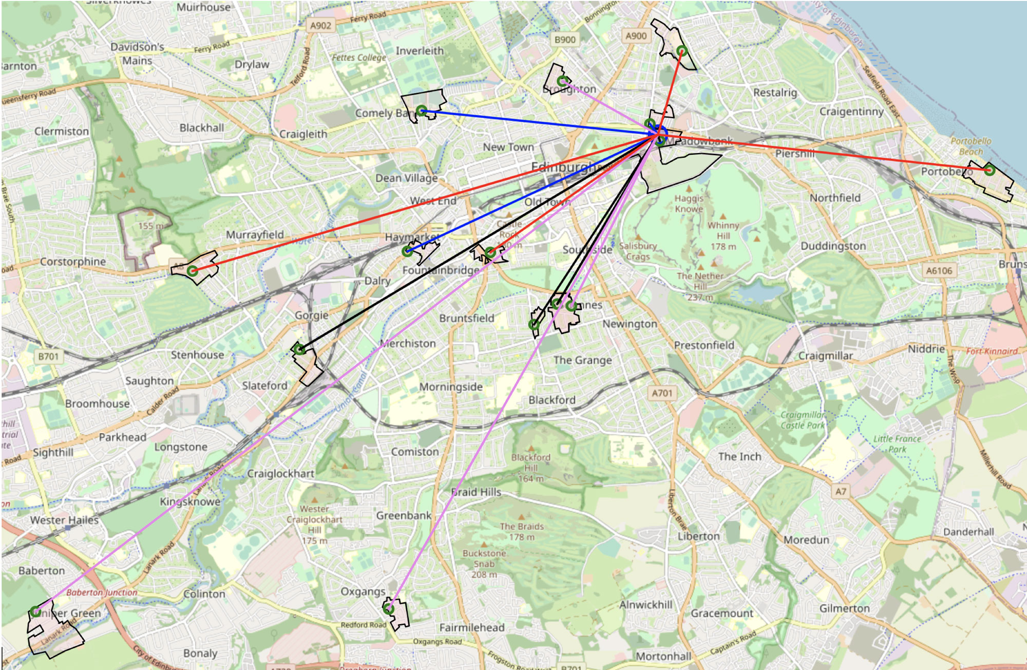
The Smith family visits a total of 14 places in 13 different Data Zones. However, once a lockdown is enacted, the Smith household will only be allowed to visit the 4 essential locations that they frequent, and only 3 Data Zones outside the zone in which they live. Through these visualisations, we see a direct benefit of the lockdown on an individual family: by limiting their movement the chance of infection has significantly reduced. This also limits the spread of the virus if one of the family members becomes COVID-19 positive.
Viruses spread between people and places, therefore places which are well-connected have the potential to be infection hotspots. We use the PageRank algorithm to measure the transmission rate of the people and places in Edinburgh, where the relationships between people and places are weighted by a modelled transmission risk. We can compare the results of this PageRank implementation with the results we obtain when we apply the same PageRank algorithm but move Edinburgh into lockdown, shutting down all non-essential locations and prohibiting non-essential travel.
| No Lockdown | Lockdown | ||
| Place | Transmission Score | Place | Transmission Score |
| UNIVERSITY HEALTH SERVICE | 372.1839 | UNIVERSITY HEALTH SERVICE | 401.1857 |
| William Fraser Centre | 339.5695 | William Fraser Centre | 357.4186 |
| Astley Ainslie Hospital | 337.1176 | Astley Ainslie Hospital | 354.9708 |
| The Islay Centre | 335.5462 | The Islay Centre | 354.1835 |
| Inchkeith House | 334.3361 | Inchkeith House | 352.1255 |
| Findlay House | 333.9583 | Findlay House | 352.0304 |
| Royal Edinburgh Hospital | 333.8251 | Royal Edinburgh Hospital | 351.5394 |
| Ellen’s Glen House | 333.3065 | Ellen’s Glen House | 351.0983 |
| Princess Alexandra Eye Pavilion | 332.1568 | Corstorphine Hospital | 350.1479 |
| Royal Victoria Hospital | 332.0636 | Royal Victoria Hospital | 349.9666 |
| Ferryfield House | 331.8664 | Ferryfield House | 349.6236 |
| Corstorphine Hospital | 331.5749 | Princess Alexandra Eye Pavilion | 349.5447 |
| Edinburgh Dental Institute | 331.0361 | Edinburgh Dental Institute | 348.8654 |
| Royal Hospital for Sick Children | 330.7948 | Royal Hospital for Sick Children | 348.7638 |
| Ballenden House | 330.6287 | Ballenden House | 348.5723 |
The top 15 ranked locations in both PageRank results were almost identical with only two places switched. They include hospitals, GP’s, and other health services, all of which are essential and would remain open during the COVID-19 lockdown. This is somewhat expected: health services are necessarily high-risk. However, if we look at the 1,000 places with the highest transmission scores, we see some variation between the two results. Some of the non-essential services which are in the top 1,000 weighted PageRank include children’s play areas, parks and gardens, museums, and schools, after lockdown has been imposed these locations will no longer increase virus transmission.
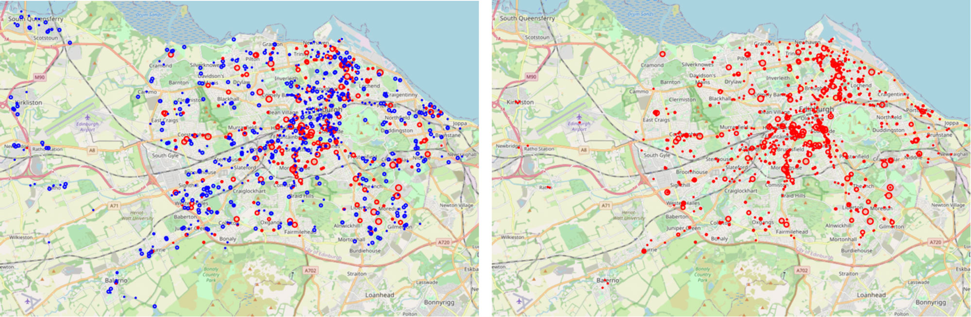
Below we map out the 1,000 locations with the highest transmission scores. Where essential locations are represented on the map by red circles and non-essential locations are represented on the map by blue circles. The size of each circle on the map is determined by the transmission score. The map on the left is Edinburgh prior to a lockdown, and the map on the right is Edinburgh while a lockdown is in place.
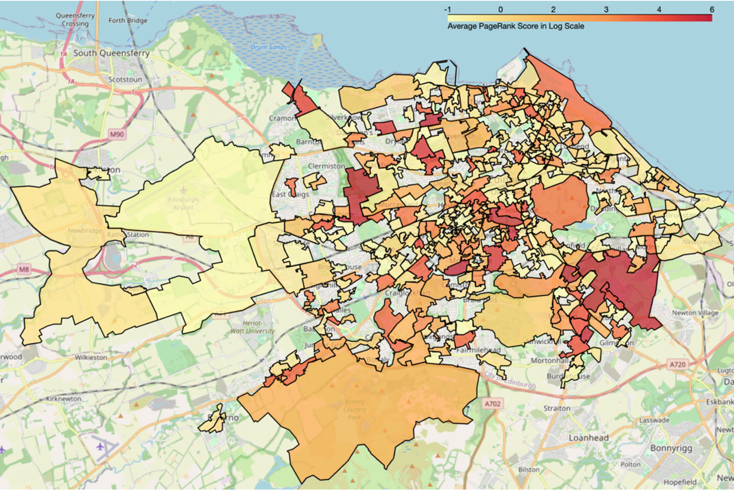
We can also visualize this in terms of Data Zones. We took the average transmission scores from the top 1,000 locations for each Data Zone. Prior to lockdown and social-isolation restrictions, we have the following:
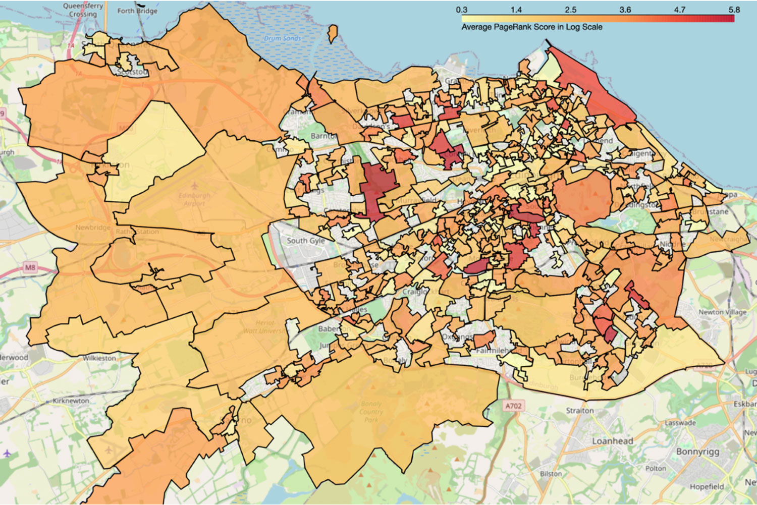
Prior to lockdown the five Data Zones which are the most vulnerable are: ‘Corstorphine – 04’, Craigleith, Orchard Brae and ‘Crewe Toll – 02’, ‘Meadows and Southside – 02’, ‘Merchiston and Greenhill – 01’ and ‘Liberton East – 02’. These specific Data Zones have the highest average transmission rate, meaning there is a higher risk of spreading COVID-19.
Once a lockdown is enacted, we have the following map visualizing the Data Zones with the highest transmission rates.
During lockdown the five most vulnerable Data Zones are: ‘Craigmillar — 04’, ‘Liberton East — 02’, ‘Merchiston and Greenhill — 01’, ‘Corstorphine — 04’, and ‘Boswall and Pilton — 03’.
Although some of the most vulnerable Data Zones are the same, there are a lot less vulnerable Data Zones illustrated in the Edinburgh post-lockdown ranking than in the ranks prior to the lockdown. Rural areas in particular greatly benefit from the lockdown restrictions: the rural areas of Edinburgh either have lower relative scores or do not score at all. In such locations, where health services are more sparse, reducing virus transmission could reduce the additional burden on the healthcare system that COVID-19 cases create.
We see that once social isolation procedures are activated the number of Data Zones with high transmission rates has significantly reduced, and more vulnerable rural areas are also positively impacted by a city-wide lockdown.
Where can we take this?
At Brainnwave, we utilize graph databases to gain valuable insights into your data. In this example, by creating a network model using real-world data, we can analyse the infective potential of COVID-19 in the city of Edinburgh and its surrounding areas. In the future, we can implement network science algorithms on datasets tailored to specific communities, cities, and regions across the world.
We’re also interested in ways to predict connections between people and places: we can use state-of-the-art link prediction algorithms (such as the ones discussed here and here) to understand the network structure of cities and societies, and determine what other areas are likely to become infected when there is a viral spike in a particular location, even when there are no explicit connections between them.
By identifying and analysing a variety of datasources, we want to create more tools that can be used to understand how different lockdown measures affect transmission rates at a fine granularity. We believe that by utilizing data resources alongside modern machine learning and analytical methods, we can determine how more targeted lockdown methods can allow society to open up again, while keeping the safety of its citizens as a priority and reducing the risk of future surges in COVID-19 cases.